Mastering Selectors & Properties in CSS
Ever wondered how a website transforms from plain text to a stunning visual experience? It all starts with the amazing trio of CSS: Selectors, Properties, and Values.
Why Selectors, Properties, and Values Are the Core of CSS
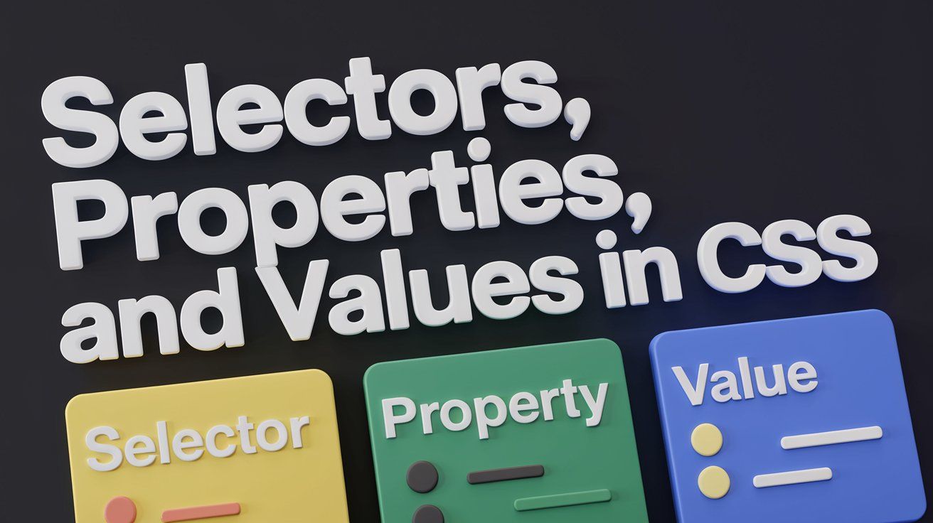
- Selectors identify which web pages elements you want to style.
- Properties define what aspect of the element to style, like color, size, or font.
- Values specify the exact style to be applied. Together, they give you complete control over your website's visual presentation, ensuring that every detail is ready to deliver the perfect user experience.
- Understanding and mastering this trio is the key to unlocking the full creative potential of CSS.
Why You Should Master These Concepts
- Mastering selectors, properties, and values is key to crafting sleek, well-structured websites.
- These core CSS concepts give you the power to style your pages with precision and creativity.
- With the right use of selectors, you can target elements smartly, making your design adaptable and easy to manage.
- Getting a grip on properties and values lets you shape how everything looks and behaves on the screen.
- Nail the right combo, and you’ll boost performance, responsiveness, and overall user experience.
- Whether you're building a simple page or a complex layout, these CSS basics are the secret to writing clean, efficient code that delivers every time.
What Are Selectors?
- Selectors in CSS act as the address book for styling web elements.
- They help you choose specific parts of the webpage to style.
- Selectors allow you to target elements directly for customization.
- Basic selectors like `h1` target all headings, while class selectors like `.button` target elements with a specific class.
- They offer precision in styling, ensuring your page looks exactly as intended.

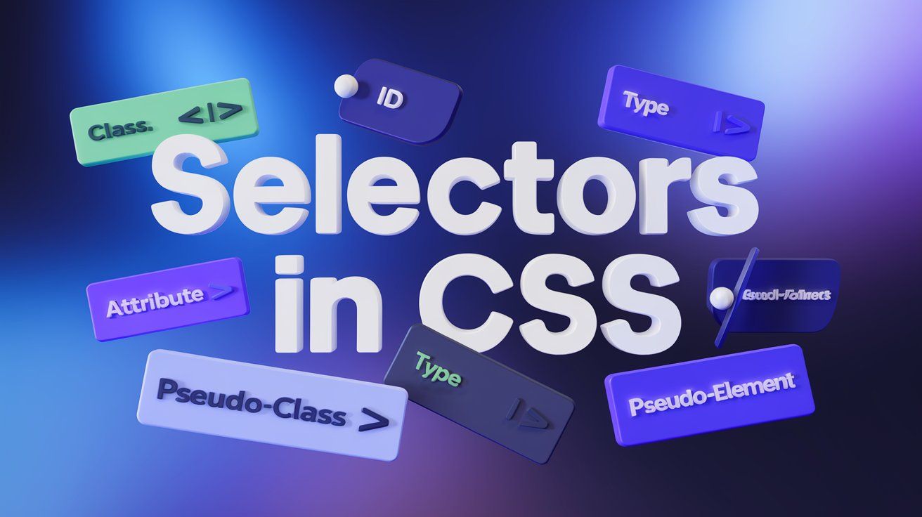
Types of Selectors
1. Basic Selectors
A) Element Selector: Selects all elements of a specified type (e.g., all <p> tags).
1<!DOCTYPE html>
2<html lang="en">
3<head>
4    <style>
5        p {
6            color: blue; /* Changes the text color of all <p> elements to blue */
7        }
8    </style>
9</head>
10<body>
11    <p>This is the first paragraph.</p>
12    <p>This is the second paragraph.</p>
13</body>
14</html>
15
Here, we are selecting all <p> elements and applying a blue color to their text. Any paragraph you write in the HTML will now have blue text.
B) Class Selector: Targets all elements that have a particular class (e.g., .button).
1<!DOCTYPE html>
2<html lang="en">
3<head>
4    <style>
5        .button {
6            background-color: yellow; /* Changes background to yellow for all elements with class 'button' */
7            color: black;
8        }
9    </style>
10</head>
11<body>
12    <button class="button">Click Me</button>
13    <button>Normal Button</button>
14</body>
15</html>
16
We use .button to target all elements with the class="button" attribute. Only the button with the class button has a yellow background.
C) ID Selector: Selects a unique element with a specific ID (e.g., #header).
1<!DOCTYPE html>
2<html lang="en">
3<head>
4    <style>
5        #header {
6            background-color: lightblue; /* Changes background color to light blue for element with id 'header' */
7        }
8    </style>
9</head>
10<body>
11    <h1 id="header">Welcome to My Website</h1>
12    <p>This is some content.</p>
13</body>
14</html>
15
The #header selector is applied to the element with id="header" Unlike classes, IDs are unique and can be applied to only one element.
2. Combinator Selectors
A) Descendant Selector : Selects all elements that are descendants (at any level) of a specified parent element.
1<!DOCTYPE html>
2<html lang="en">
3<head>
4    <style>
5        div p {
6            color: green; /* All <p> inside <div> will have green text */
7        }
8    </style>
9</head>
10<body>
11    <div>
12        <p>This paragraph is inside a div and is green.</p>
13    </div>
14    <p>This paragraph is outside the div and is not affected.</p>
15</body>
16</html>
17
The rule div p applies styles to all <p> tags that are inside a <div>. Paragraphs outside the <div> won’t be affected.
B) Child Selector (>): Selects all elements that are direct children of a particular parent element.
1<!DOCTYPE html>
2<html lang="en">
3<head>
4    <style>
5        ul > li {
6            color: red; /* Direct <li> children of <ul> will have red text */
7        }
8    </style>
9</head>
10<body>
11    <ul>
12        <li>This list item is red.</li>
13        <li>This list item is also red.</li>
14        <ol>
15            <li>This is a nested list item, not affected.</li>
16        </ol>
17    </ul>
18</body>
19</html>
20
ul > li applies styles only to the <li> elements that are direct children of <ul>. Nested <li> elements inside other lists won't be affected.
C) Adjacent Sibling Selector (+): Selects an element that directly follows another specific element.
1<!DOCTYPE html>
2<html lang="en">
3<head>
4    <style>
5        h1 + p {
6            color: purple; /* Only the <p> that directly follows an <h1> will have purple text */
7        }
8    </style>
9</head>
10<body>
11    <h1>This is a heading</h1>
12    <p>This paragraph is purple because it follows the heading.</p>
13    <p>This paragraph is not purple.</p>
14</body>
15</html>
16
The h1+p selector styles the <p> element that comes directly after an <h1>. Only the first paragraph after the heading is purple.
D) General Sibling Selector (~): Selects all sibling elements that follow a specified element
1<!DOCTYPE html>
2<html lang="en">
3<head>
4    <style>
5        h2 ~ p {
6            color: orange; /* All <p> elements after an <h2> will have orange text */
7        }
8    </style>
9</head>
10<body>
11    <h2>Subheading</h2>
12    <p>This paragraph is orange.</p>
13    <p>This one is orange too.</p>
14</body>
15</html>
16
h2 ~ p selects all <p> elements that are siblings of <h2> and apply the orange color to them.
3. Attribute Selectors
Selects elements based on the presence or value of their attributes (e.g., [type="text"] selects input fields with a type attribute of "text").
1<!DOCTYPE html>
2<html lang="en">
3<head>
4    <style>
5        input[type="text"] {
6            border: 2px solid red; /* Applies red border to text input fields */
7        }
8    </style>
9</head>
10<body>
11    <input type="text" placeholder="Type something...">
12    <input type="password" placeholder="Password">
13</body>
14</html>
15
The selector input[type="text"] targets only the input fields with type="text" Other input fields, like password, remain unaffected.
4. Pseudo-Classes and Pseudo-Elements
A) Pseudo-Classes: Target elements in a specific state.
1<!DOCTYPE html>
2<html lang="en">
3<head>
4    <style>
5        a:hover {
6            color: red; /* Changes link color to red when hovered over */
7        }
8    </style>
9</head>
10<body>
11    <a href="#">Hover over me!</a>
12</body>
13</html>
14
The a:hover selector applies styles when the user hovers over the link. In this case, the link turns red when hovered.
B) Pseudo-Elements: Apply styles to a specific part of an element, such as the first line or first letter.
1<!DOCTYPE html>
2<html lang="en">
3<head>
4    <style>
5        p::first-letter {
6            font-size: 30px; /* Makes the first letter of the paragraph bigger */
7            color: blue;
8        }
9    </style>
10</head>
11<body>
12    <p>This is a paragraph with a big first letter.</p>
13</body>
14</html>
15
The p::first-letter pseudo-element applies styles to the first letter of the paragraph. The first letter will be larger and blue.
What Are Properties and Values?
- A Property defines what you want to change, like font size, color, or spacing.
- A Value specifies the exact change, such as setting the font size to 16px or color to red.
- Properties and values together determine how your webpage looks and behaves.
- They control everything from small details to the overall design of your site.
- A Value specifies the exact change, such as setting the font size to 16px or color to red.
- Properties and values together determine how your webpage looks and behaves.
- They control everything from small details to the overall design of your site.

Types of Properties and Values
1. Text and Font Properties
Shape the personality of your content by adjusting fonts, sizes, colors, and alignment to capture attention and enhance readability.
1p {
2  font-size: 16px; /* Makes text size 16 pixels */
3  color: #333333;  /* Changes the text color to dark grey */
4  text-align: center;  /* Centers the text */
5  font-family: Arial, sans-serif; /* Sets the font to Arial */
6}
7
In this example, the font-size sets the text size, color defines the text color, centers the text in its container, and font-family changes the font style.
2. Color and Background Properties
Create dynamic visual appeal by defining color schemes, gradients, and background images that make your designs pop.
1div {
2  background-color: #f0f0f0;  /* Sets the background to light grey */
3  color: black; /* Sets the text color to black */
4  background-image: url('background.jpg'); /* Adds a background image */
5  background-size: cover; /* Ensures the image covers the entire div */
6}
7
Here, background-color sets the background color, color sets the text color, and background-image adds an image as the background. background-size: cover makes sure the image covers the full div.
3. Box Model Properties
Gain precise control over spacing and structure by manipulating margins, padding, borders, and dimensions to build a seamless layout.
1.box {
2  margin: 20px;  /* Adds space outside the element */
3  padding: 15px; /* Adds space inside the element */
4  border: 2px solid black; /* Adds a black border */
5  width: 200px; /* Sets the width */
6  height: 100px; /* Sets the height */
7}
8
In this code, margin creates space outside the element, padding adds space inside, and border adds a visible border. width and height define the size of the box.
4. Layout Properties
Architect your page with precision using properties that dictate the position, flow, and stacking of elements for a clean, intuitive user experience.
1.container {
2  display: flex; /* Activates flexbox layout */
3  justify-content: center; /* Centers child elements horizontally */
4  align-items: center; /* Centers child elements vertically */
5}
6
display: flex makes the element a flex container. justify-content: center centers child elements horizontally, and align-items: center centers them vertically within the container.
5. Flexbox and Grid Properties
Build adaptable, responsive layouts that flexibly adjust across devices, offering a modern solution for design challenges.
Example (Flexbox)
1.flex-container {
2  display: flex; /* Makes the container a flexbox */
3  gap: 10px; /* Adds space between items */
4}
5
6.flex-item {
7  flex-grow: 1; /* Allows items to grow and take available space */
8}
9
Example (Grid)
1.grid-container {
2  display: grid; /* Activates grid layout */
3  grid-template-columns: 1fr 1fr 1fr; /* Creates 3 equal columns */
4  gap: 10px; /* Adds space between grid items */
5}
6- Flexbox aligns items in a row or column and lets them grow as needed (flex-grow).
- Grid divides a container into rows and columns, letting you place items in a structured way (grid-template-columns)
We will discuss this in detail in upcoming blogs!!
6. Animation and Transition Properties
Bring your website to life with fluid animations and transitions that engage users and create memorable interactions.
1button {
2  transition: background-color 0.3s ease; /* Changes background color over 0.3 seconds */
3}
4
5button:hover {
6  background-color: blue; /* Changes background to blue on hover */
7}
8
transition makes the background color change smoothly when hovering. The 0.3s sets the duration of the transition, and ease creates a smooth effect.
Wrapping It All Up
- Mastering CSS selectors, properties, and values empowers you to create visually stunning, responsive, and user-friendly websites.
- With these core concepts, you can precisely target and style elements, craft dynamic layouts, and add engaging animations.
- Once you’ve got a solid grasp, the creative possibilities are endless, allowing you to design polished, high-performing web pages with ease.